
Toontown Corporate Clash modernizes the original Toontown Online in many ways, but one aspect of the game that I wanted fixed for so long was the mailbox user interface. I decided to take on the challenge myself and redesign the Toontown Corporate Clash mailbox UI to help make the user experience far less cumbersome.
1. So why redesign the Toontown mailbox at all?
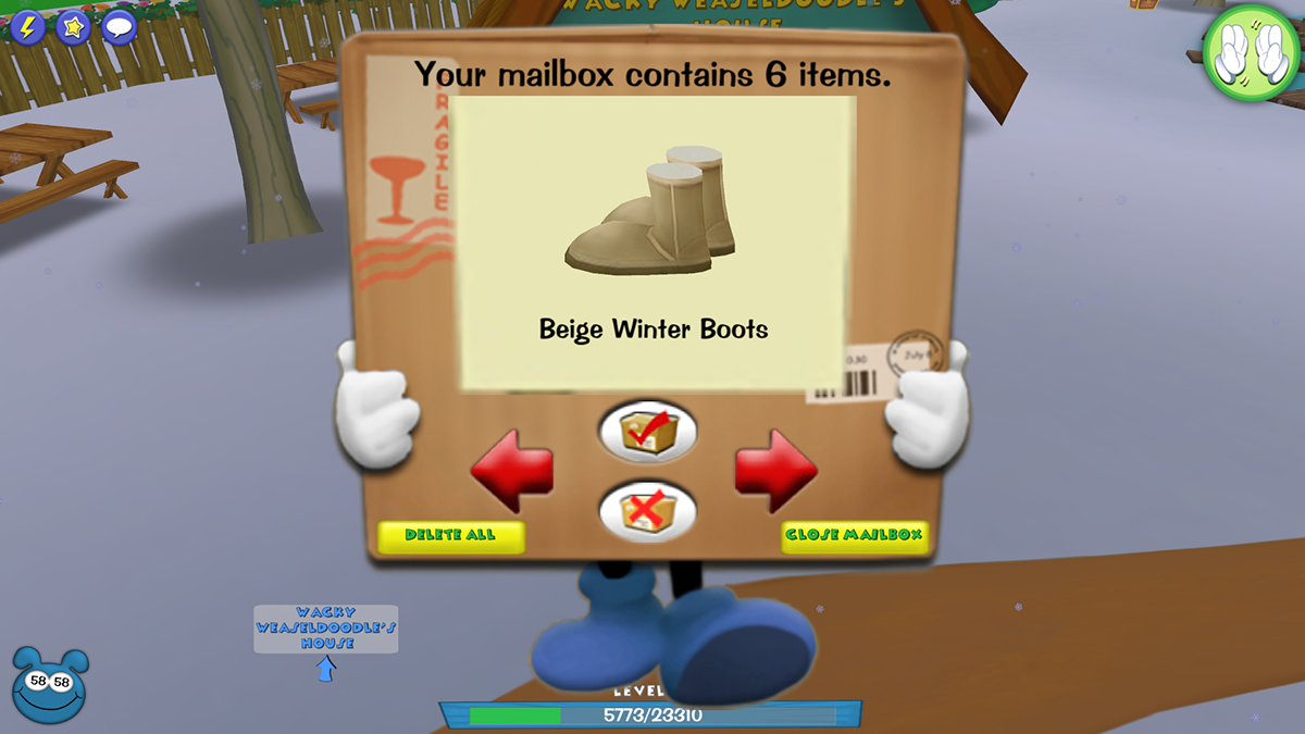
As a Toontown player since 2007, one aspect of the game that puzzled me even today was the mailbox. In Toontown Online, Toontown Rewritten, and Toontown Corporate Clash, the mailbox serves as a place to acquire items you have purchased or been gifted to you. However, each item appears on the screen one at a time so you can't see all items at once. While this isn't so bad for one item, it becomes slowed down when you have multiple items in your mailbox. Below, in order to see and accept all six items, I'd need to click at least 6 times. I asked myself, "Can we make this work better for the user?"
2. To redesign the mailbox UI, where's the best place to start?
In order to figure out a starting point, I decided to utilize the 10 Heuristics Evaluation method. Overall, the mailbox's requirement of recall over recognition was a problem as you can only ever see one item at a time, which also greatly affects the efficiency of use as you have to keep clicking and clicking to see each item. With this foundation, I went forward to create some basic wireframes. I had also conducted some one-question interviews to get some ideas of what other users thought of the current mailbox, with words such as "clunky" and one user saying "The fact it isn't a list bothers me a lot" sticking out the most to me.
3. How should users navigate the new interface?
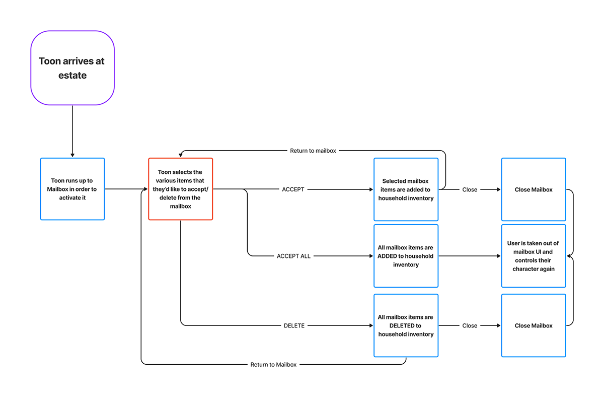
When creating the wireframes, I wanted to be sure users could see more options at once as well as easily select or find what they need. So in order to create that, I decided to draft up a very simple user flow to accommodate for the new UI. After much deliberation, I then went with a user flow of the toon going to the mailbox, selecting the primary options such as ACCEPT, ACCEPT ALL, and DELETE while also allowing them to select which various items in their mailbox that they'd like to affect.
Once I had a clear vision of how navigation would work, I wanted to create some basic UI stills to gather general ideas of how I should progress. I started off creating a few samples in order to gauge a starting point and build upon using the flow above. After asking some Toontown players about what they liked most, nearly 100% of those asked wanted a design similar to the right-most one so that is what I built my design off of.


I had originally wanted to go with a design that showed ACCEPT and DELETE symbols when you moused over an item in the mailbox. After using other applications such as Spotify where this was exactly the way it works, my idea was changed and this instead led me to adapt the layout on the right.
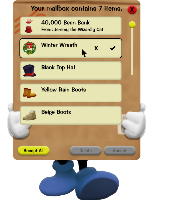
The overall setup is that all your items are shown where you can then accept, accept all, or delete the items that you'd like at will rather than item-by-item via multi-select. I had asked players what their thoughts were on the original Delete All button, and several were left confused as to why Accept All was not an option, so a multi-select system combined with an accept all allowed players to get in and out of the mailbox as quickly as needed. When asked about this sort of button, users tested reflected the sentiment in interviews.
The overall setup is that all your items are shown where you can then accept, accept all, or delete the items that you'd like at will rather than item-by-item via multi-select. I had asked players what their thoughts were on the original Delete All button, and several were left confused as to why Accept All was not an option, so a multi-select system combined with an accept all allowed players to get in and out of the mailbox as quickly as needed. When asked about this sort of button, users tested reflected the sentiment in interviews.
Overall, the final tested low fidelity proved to be quite successful and was able to help reduce actions needed to add items to the household inventory by around 50%.

4. But how does one bring it into the Toontown artstyle in high fidelity?
It's always incredibly easy to forget that a high fidelity version of an interface often comes with its own challenges especially for an already existing game like Toontown and its very colourful and whimsical style. So I spent some time analysing the mailbox UI and really took a deep look at what was on offer. In the end, I did a more stylised version of the low fidelity UI that I had already made as a starting point.


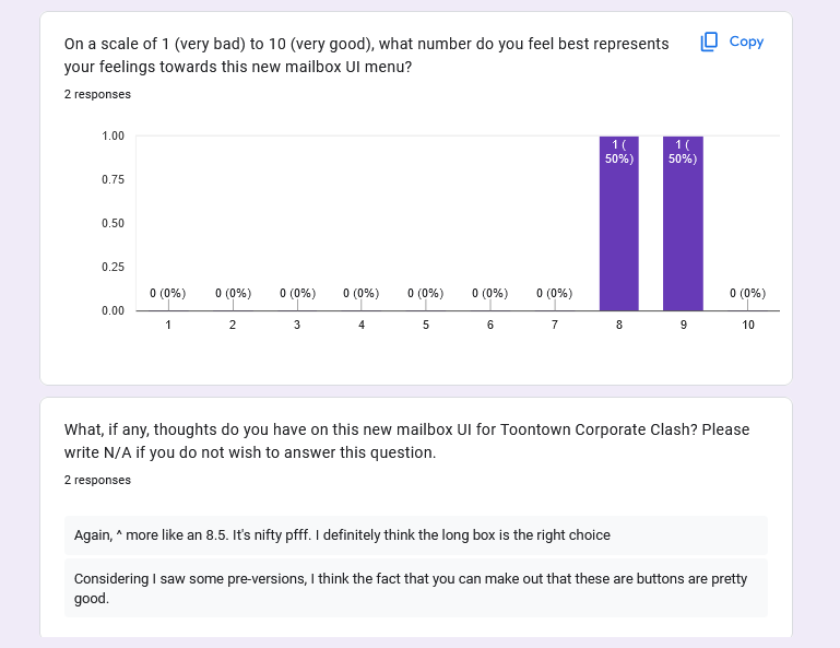
With this new change, I didn't want to abandon the design of the current mailbox as it is actually incredible. Toontown's designs have always been a favourite of mine so it's something I wanted to preserve. One of the biggest changes between low and hi-fi was the selection box. The text containing an item's name was originally supposed to just exist outside of the box containing the particular mailbox item, but it looked incredibly awkward and difficult to read. After I conducted an A+B test, results showed that nearly 67% of those asked preferred the long box. Meanwhile, there was a shared sentiment about it in usability testing.
One noted issue came up, however, that if nobody has anything selected, why should accept/decline be active? It would be confusing for users if they could still see an active accept/delete button only to be told "You need to select something first" so to improve the user experience, users get access to these buttons if something is selected. Alternatively, the ACCEPT ALL is always active as a quicker route. But two major points came up: the close mailbox button was not in a well-liked design nor position and the hands being clipped felt incredibly awkward. I had originally left CLOSE MAILBOX outside to give the rest of the UI space to breathe, but the testers mentioned it needed to be moved inside and/or made a little less cluttery, which resulted in this final design. With the clipped left hand, testers noted it was strange to have one hand be visible and one be only partially visible.
With the final designs and usability tests concluded, I was confident in this project being completed.


5. But how does this improve a player's user experience with their mailbox?
This is one of the biggest questions to ask before a project ever begins and to demonstrate after it's completed. In this case, as shown above, this redesign improves the experience by allowing users to see an entire list of their items at once rather than needing to click buttons to see more, allows users to more quickly bring items to their household inventory at a single button press, and giving users far more flexibility in what to delete and what to accept from their mailbox.
6. In conclusion, what was learned, what would I have done differently, and how does it end?
Ultimately, where we end is essentially a brand new interface in Toontown's style that has been user-tested and user-approved! What I would have done differently wholeheartedly would perhaps try to use more of my own ideas that I scrubbed off (such as icons appearing in an item's section only during mouse-over with an example below) or perhaps doing more in-game or Toontown subreddit interviews on top of my user interviews. Below is a sample of what was not used.
Overall, this project was created off of an idea that I'd had for a while and I am satisfied with the result.


